One more datapoint on the equity bubble

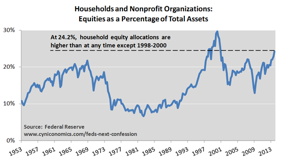
The latest Flow of Funds Report (link to pdf) shows that equities comprise a greater share of US household assets than at any point besides the height of the internet bubble. Of course, elevated prices alone will increase that figure, but individuals have a tendency to increase their allocations to an asset class at precisely the time that they should consider scaling back or exiting. With no significant setbacks for three years now, the mood seems to be, “come on in – the water’s fine.”

Equities as percent household assets 2014Hat tip Cyniconomics

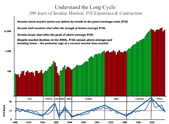
Chart: Secular Bear Markets Since 1900

Secular Bear Markets (red) since 1900. Source: Crestmont Research

Secular Bear Markets (red) since 1900. Source: Crestmont Research

I like this chart, but I would change one thing: the bear that started in 1929 could extend clear through to 1948 due to inflation and multiple compression.

Inflation (regular CPI) has reached double digits in the final years of each of the last secular bears. It was inflation that made the 1910s and 1970s markets into bears, since the nominal Dow was trending sideways.

Previous secular bear markets haven’t ended until PEs are compressed to near 10. Right now the S&P 500 trailing PE is near 15, with the Shiller PE over 23.


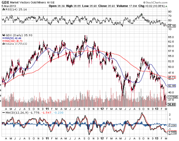
Gold stocks oversold and underloved

Sentiment and price action are extreme. Combined, they make a very strong case for a rebound.

gdx march 5

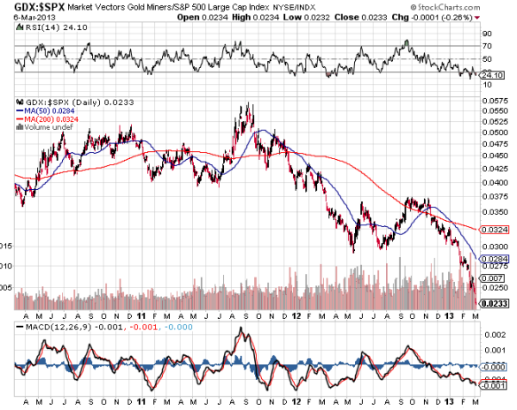
Gold stocks are also very cheap relative to the broad indices, as well as gold itself (which is also the most under-loved since it was $300 per ounce).

gdx to spx march5

gdx to gold march5

Images from stockcharts.com

Gold itself is still very expensive relative to other hard assets and financial assets on an historical basis, but trader sentiment is bleak, a contrary indicator. From 2001 to the top in 2011, we never had such a long down streak on such bearishness, which may indicate, despite its short-term bullish implications, that the bull market may have topped at $1920 per- in August 2011. We had parabolic moves on extreme bullishness in gold (peaking 8.11), silver (5.11) and platinum (3.08), and moves like that tend to burn up all reserves of excitement and mark tops for years to come.

Active investment managers more bullish than ever

The average active manager is now leveraged long, according to NAAIM’s weekly survey:

Sustained bullishness is bearish, especially once the market starts to trend sideways. We don’t yet have that choppy sideways action on declining RSI that has been a death knell for rallies, but sooner or later it will emerge. If the market starts sidedays, this would complete the most bearish syndrome possible, though we already have a market that is overbought and overvalued, with overbullish sentiment and rising bond yields (John Hussman’s bearish syndrome that has nailed most major tops for decades).

In economic news, Q4’s negative GDP print supports the thesis that we entered a recession in the 2nd half of 2012, as leading indicators had been suggesting for months. It also comes right as the Citi Economic Surprise Index is again on the downward slope of its regular cycle, meaning surprises are more likely to be to the downside.

Market again overbought on overbullish sentiment

The global economy is clearly on the downswing, with the US likely having entered a recession this summer (watch for revisions in GDP and employment data in the coming months). However, as in Sept-Oct 2007, the equity market has bounced from a brief oversold interlude to a new high.

Here is the NAAIM survey. This is a relatively new dataset, but it has proved high-correlated with proven sentiment indicators like DSI and Rydex fund activity). The survey is updated each Thursday with data from Wednesday.

NAAIM Sentiment Survey, 19 Sept 2012

Sentiment has been elevated for a month, which is sufficient for a significant decline, though the likelihood of a setback and the expected magnitude thereof grows with each week that it remains elevated. This, coupled with sideways price action for few weeks (we don’t have this yet) and a declining trend in daily RSI (possibly developing) would virtually lock in the case for an intermediate-term top.

S&P500 daily chart, Yahoo Finance

EDIT: To clarify, this is not a screaming short-term sell yet, since the market has had a habit of creaping slightly higher over a few weeks from conditions like this. However, things can reverse at any time, and it is highly likely that any further gains will be quickly erased once the turn comes.

The macro picture of deteriorating economic data bolsters the case that a bull market top is near, so if this is an intermediate-term top it could prove to be the final top prior to a bear market. This cyclical bull is now 3.5 years old. This is long in comparison to the cyclical bulls of the 1910s and 1970s secular bear markets (18-36 months was typical), but short in comparison to the last cyclical bull (spring 2003 – fall 2007, 4.5 years).

Topping pattern developing, stay tuned

We finally have a weakening trend on the daily RSI (see RSI on bottom of chart). This is a prerequisite for anyone considering taking a short position, especially with leverage.

It would be typical for some type of quick plunge to develop soon, perhap on the order of 5-8% in SPX, maybe 100 points (1000 Dow points). It would also be typical for stocks to recover from such a plunge and test the highs again, as in spring 2011 or Summer-Fall 2007. In May 2010, this process was compressed in the “Flash Crash,” which was followed quickly by a decline of around 20%.

However, the weekly trend is still up, though finally in overbought territory. Perhaps this begins to turn over the next few weeks as the market chops sideways.

Further strengthening the bear case is sentiment, which has now been elevated for at least two months (I recommend sentimenttrader.com at $30/month for all you can eat indicators). Sentiment is a powerful indicator, but actual price tops lag tops in sentiment by several weeks to months, as prices tend to levitate and chop sideways for a while on weakening RSI prior to major declines. Bottoms have a much closer time relationship to sentiment (extreme bearishness among traders is usually quickly followed by rallies).

The best free sentiment resource that I am aware of is the NAAIM Survey of Manager Sentiment. As you can see in the chart below, sustained bullish sentiment is required in order to register a valid sell signal, as the crowd is often right for a while. The relatively short period of bullishness here is another sign that any decline that develops soon could be short-lived.

I should also mention that John Hussman has noted that the market has exhibited his syndrome of overbought, overvalued, overbullish on rising yields, for several weeks now. This set of conditions coincides with many of the very worst times to be long stocks, and has almost no false positives. Advances made during such periods are soon given up, often in severe declines.

The following set of conditions is one way to capture the basic “overvalued, overbought, overbullish, rising-yields” syndrome:

1) S&P 500 more than 8% above its 52 week (exponential) average
2) S&P 500 more than 50% above its 4-year low
3) Shiller P/E greater than 18
4) 10-year Treasury yield higher than 6 months earlier
5) Advisory bullishness > 47%, with bearishness < 27% (Investor’s Intelligence)

[These are observationally equivalent to criteria I noted in the July 16, 2007 comment, A Who’s Who of Awful Times to Invest. The Shiller P/E is used in place of the price/peak earnings ratio (as the latter can be corrupted when prior peak earnings reflect unusually elevated profit margins). Also, it’s sufficient for the market to have advanced substantially from its 4-year low, regardless of whether that advance represents a 4-year high. I’ve added elevated bullish sentiment with a 20 point spread to capture the “overbullish” part of the syndrome, which doesn’t change the set of warnings, but narrows the number of weeks at each peak to the most extreme observations].

The historical instances corresponding to these conditions are as follows:

December 1972 – January 1973 (followed by a 48% collapse over the next 21 months)

August – September 1987 (followed by a 34% plunge over the following 3 months)

July 1998 (followed abruptly by an 18% loss over the following 3 months)

July 1999 (followed by a 12% market loss over the next 3 months)

January 2000 (followed by a spike 10% loss over the next 6 weeks)

March 2000 (followed by a spike loss of 12% over 3 weeks, and a 49% loss into 2002)

July 2007 (followed by a 57% market plunge over the following 21 months)

January 2010 (followed by a 7% “air pocket” loss over the next 4 weeks)

April 2010 (followed by a 17% market loss over the following 3 months)

December 2010


This chart from Hussman has data through March 3, but the latest blue band is now about a month wider:

This is clearly time to exit stocks or hedge all market risk. The upside is limited relative to the downside.
Where are we in the secular (post-2000) bear?

Mish Shedlock’s investment management company, Sitka Pacific, provided this chart in their September letter (as a non-client, I only get delayed copies):

One lesson to be learned here, which they get into in the letter, is that prices bottom before valuation multiples. In the bears of the 1910s, ’29-early 40s and ’66-82, inflation appeared late in the game. BTW, this meshes with Kondratieff theory, where inflation leads to disinflation to deflation then inflation again, with asset values moving in tandem.

So, be prepared to buy in this coming wave down, if we get a nice drop over the next year or so, because select equities could be a nice hard asset to own through the turmoil in the currency and sovereign debt markets, which is likely to spread to the US, UK, Germany and Japan by later this decade.

Are there any good buys emerging in Greece?

It may be interesting to look at some of the public companies in the hardest-hit European countries, since the stock indices here are lower than anytime in at least a decade. Here are the results of a search for Greek shares, with an eye towards companies in defensive industries that will not be hurt, or could even benefit from a weaker currency.

All of these businesses are likely to survive a very bad economy, even if they go bankrupt – the question is how the equity holders will fare.

Athex index chart (Athex is now 60% lower than at the 2009 bottom): http://www.bloomberg.com/quote/FTASE:IND/chart

List of top 20 Greek companies by market cap as of May 2010: http://topforeignstocks.com/2010/05/09/the-top-20-greek-companies-by-market-capitalization/

Here are a few names – these first 2 look strongest to me (bottler and utility):

Coca Cola Hellenic Bottling Co:

Biggest foriegn Coke bottler

http://www.bloomberg.com/quote/EEEK:GA/chart

http://en.wikipedia.org/wiki/Coca-Cola_Hellenic

EUR 13.00, EPS 0.93 – not really cheap yet by earnings, 1.62x book. Keep an eye on this one.

Public Power Corp SA , ticker PPC

Biggest utility in Greece. To raise cash, the gov sold 17% of its until then 51% stake.

Plants are mostly coal-fired.

http://www.bloomberg.com/quote/PPC:GA

http://en.wikipedia.org/wiki/Public_Power_Corporation_of_Greece

EUR 5.30, EPS 1.10 – very cheap by earnings, 15% dividend yield.

Hellenic Telecommunications Organization S.A., ticker HTO

http://www.bloomberg.com/quote/HTO:GA

http://en.wikipedia.org/wiki/OTE

3.6% div yield, 15 PE. 1.14x book – not cheap at all, though stock is way down

Boutaris J & Sons Holdings SA , ticker MPK (preferred shares also traded)

6 Greek wineries, one in France, most recognised Greek wine brand

Company website: http://www.boutari.gr/?TEFORz1FTg==

http://www.bloomberg.com/quote/MPK:GA

No earnings data available, but trading at 0.3x book and 0.27x sales.

Attica Group

Largest ferry operator

http://www.bloomberg.com/apps/quote?ticker=ATTICA:GA

http://en.wikipedia.org/wiki/Attica_Group

No earnings data, but 0.12x book

ANEK Lines SA

Ferries

http://www.bloomberg.com/quote/ANEK:GA

http://en.wikipedia.org/wiki/ANEK_Lines

Europe’s dead stock markets

There is a huge range of performance among European bourses since the 2008-2009 crash. In the previous boom, all markets went up together, but these charts show that investors are now much more discriminating, and that there is a huge range of optimism among these countries.  Here is a series of 5-year charts from Bloomberg (you can browse lots more charts here):

Greece:

Iceland (I’ve never seen a stock index that looks like this – it’s more like the aftermath of a penny stock pump-and-dump):

Ireland:

Italy:

Portugal:

France:

Luxembourg:

Switzerland:(I’m surprised that this is not higher, since the economy here is strong, but the Swiss are very conservative and becoming more so, preferring cash and gold to stocks):

Denmark:

Germany (DAX):

United Kingdom (FTSE 100):

The FTSE and DAX typically trade like the S&P500, shown below for reference:

These higher-quality markets are now very expensive and technically weak, and if they enter into another bear market the lower-quality markets should follow, quickly breaking their 2009 lows. Bottom feeding value investors may then be able to find a few odds and ends in the rubble.